It’s getting more difficult to stand out in the crowd when it comes to email marketing. By 2025, it’s estimated that over 325 billion emails will be sent every day.
In our digital-dominant world, marketers need to go beyond the in-box and think more creatively about the ideal mix of media to drive results. We’ve found that to be especially true when it comes to retargeting strategies.
A well-timed direct mail piece has proven effective across industries like apparel, food, gifts, and home décor, driving engagement and conversions.
Consider this: research shows that 79 percent of households report reading or scanning their postal mail every day.
From standard to oversized, postcards have always delivered a worthy blend of cost-effectiveness and conversion rates. To achieve that, you must ensure that you’re making the most of the limited real estate available.
Direct mail design tips from the trenches
Our design experts have identified six key elements from the hundreds of millions of postcards we’ve sent to clients across various industries. These elements attract attention and drive recipients back to websites or landing pages, encouraging them to complete a purchase.
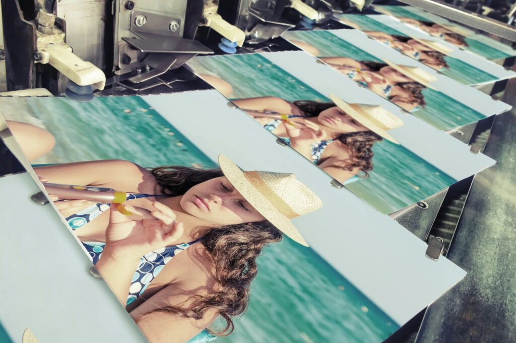
- Quality images rule the day. Treat the front of your postcard like a billboard, with a high-impact hero image and a small amount of copy. Use the reverse for two to four smaller images and a compelling, at-a-glance call to action.
- Be consistent with your brand aesthetic. Don’t deviate from the branding elements that make you well-known. From color palette and photo treatments to the brand voice in your copy, don’t make any huge shifts just because “this is print.”
- Paper choice speaks volumes. If your brand has made a commitment to environmental stewardship, reinforce your position by using 100 percent recycled paper for every mailing. Your customers are taking note.
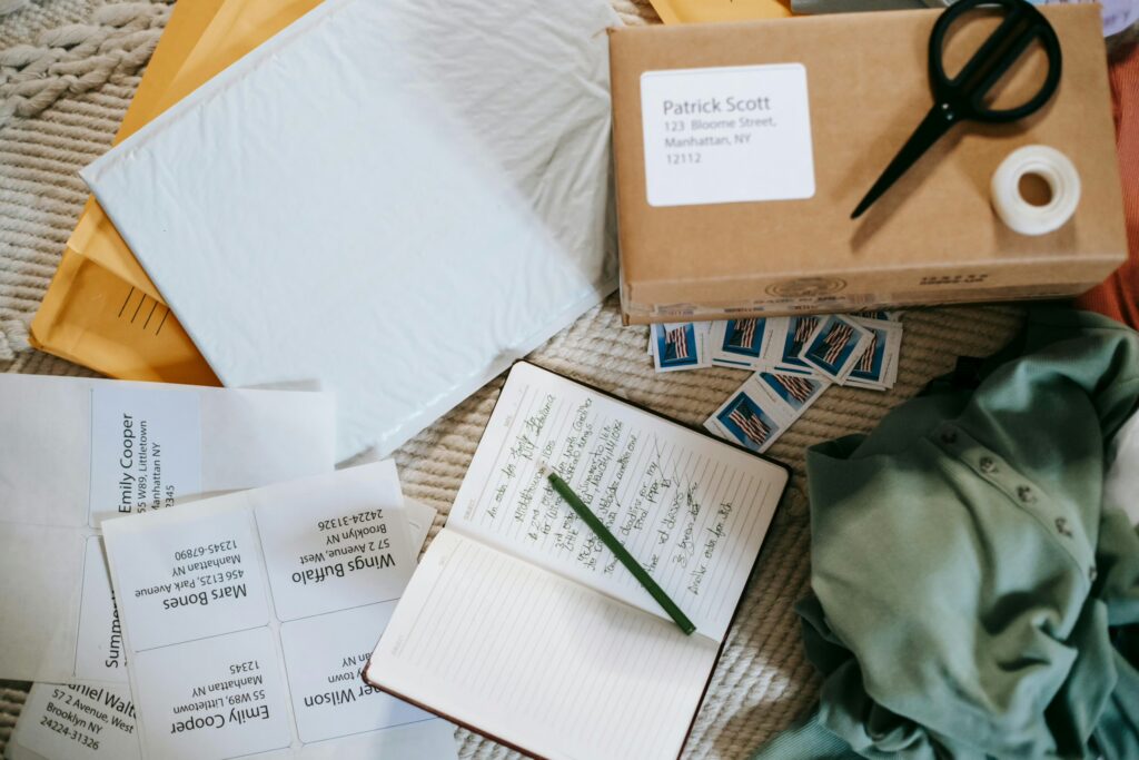
- Leverage the power of personalization. Adding an element of personalization will increase your response rate — whether it’s the recipient’s name, a customized offer or the location of their nearest brick and mortar store. According to NerdWallet, adding personalization as simple as a name can increase response rates by 135 percent.
- Use all the data at your disposal. Increase the relevancy of your postcard mailing by using retargeting data, such as an image of a highly-browsed item or a product that complements a recipient’s prior purchase.
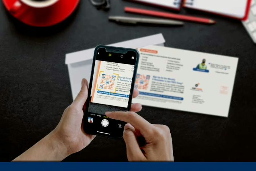
- Simplify response vehicle(s). A highly effective direct mail design tip is using a QR code, which gained popularity during the pandemic. Enhance its impact by customizing the frame, shape, or body and integrating it into your postcard’s call to action.
On the surface, a postcard mailer is pretty simple. With strategic design, data, and precise timing, direct mail can become a powerful conversion tool missing from your digital campaigns.


